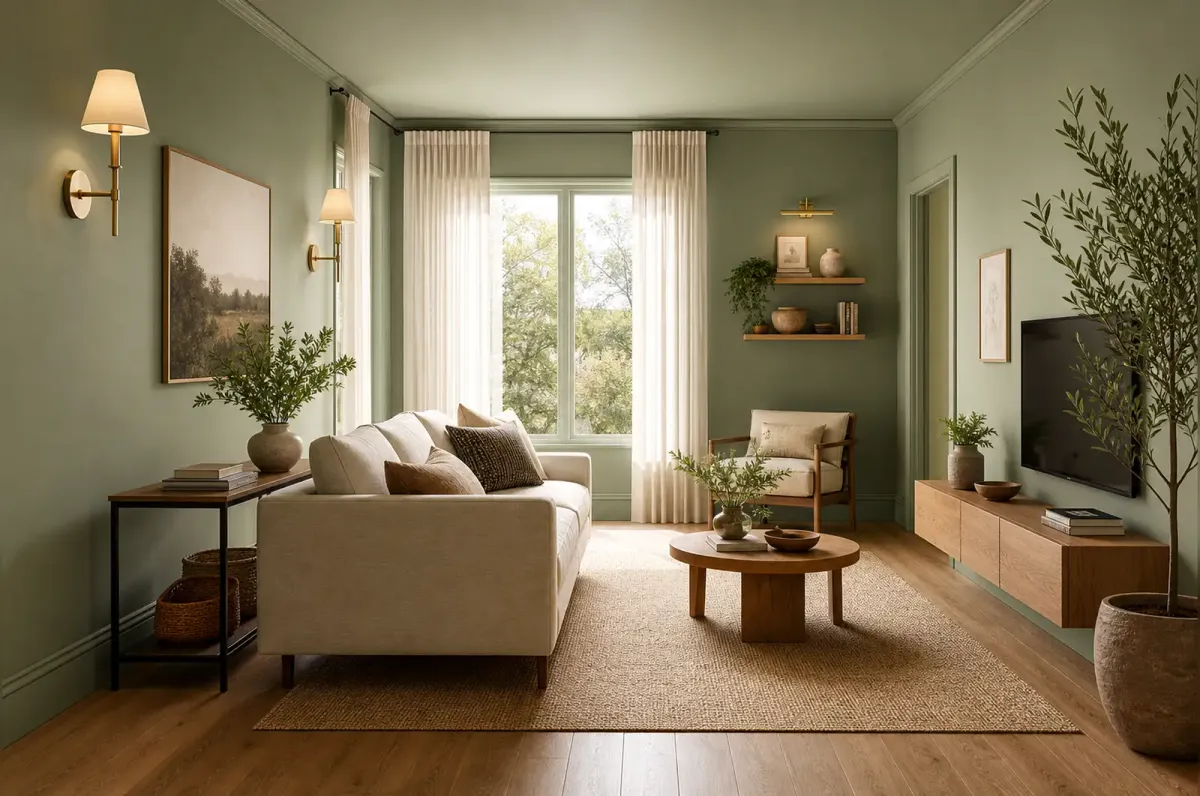
You can KonMari every drawer in the house and still walk into a room that feels cramped. That’s because physical clutter isn’t the only thing eating your square footage — the way your space is arranged, lit, and colored plays a bigger role than most people realize.
Interior designers who specialize in small spaces have a different toolkit than professional organizers. They don’t just ask “what can I get rid of?” They ask “what can I trick the eye into seeing?”
Shamika Lynch, founder of the New Jersey-based design firm Maximizing Tiny Interiors, puts it bluntly: “Every item in your home needs to serve a purpose. You don’t have extra square footage for things that are just going to be decorative.” But Lynch doesn’t stop at decluttering. She and a handful of other designers recently walked NPR’s Life Kit through five specific techniques that change how a room feels without changing its footprint.
Here’s what they said — and how to pull it off in your own place, whether you rent or own.
1. Get your furniture off the floor
The fastest way to make a small room feel bigger isn’t buying a smaller couch. It’s getting more of your stuff up off the ground.
Lynch recommends treating floor space as the most precious resource in any small home. Every item that touches the floor takes a bite out of your walking room and your visual breathing space. The fix isn’t throwing things out — it’s putting them somewhere else.
Wall-mounted sconces replace floor lamps. An over-the-door mirror replaces the leaning floor mirror. A tall, wall-mounted coat rack with a built-in bench replaces the separate entry table, shoe rack, and coat stand that were each eating floor space individually. Alexandra Gater, a home design consultant and author of Own Your Space, calls this the “dual-purpose rule”: anything that can combine two functions into one footprint should.
Faith Roberson, a professional organizer and author of What Stays and What Goes, adds another layer: go vertical. Floor-to-ceiling shelving or cabinets “give you that two-in-one benefit of adding height to your space by drawing the eyes upward, and providing storage with minimal square footage.” A single tall bookcase that goes nearly to the ceiling takes the same floor area as a short one but holds twice as much and makes the wall feel taller.
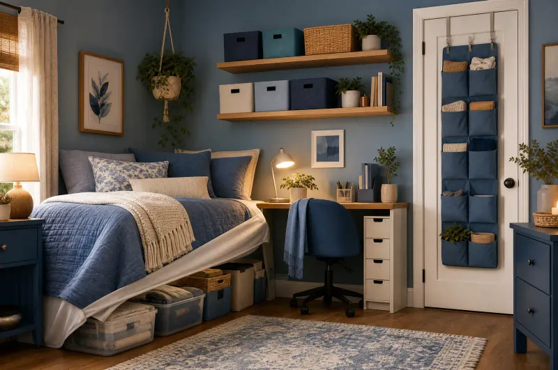
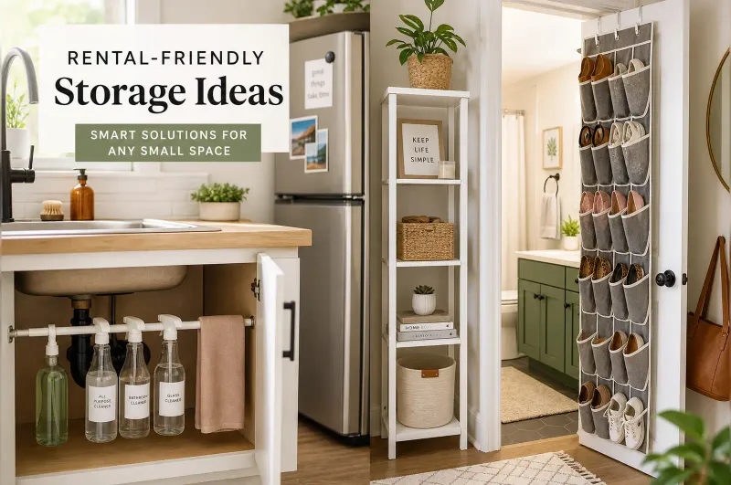
Gater’s rule of thumb for renters: plug-in wall sconces, tension-mounted shelving, and over-the-door organizers all deliver the vertical benefits without putting holes in the walls that’ll cost you a security deposit.
Roberson offers a practical test for whether a piece of furniture earns its floor space. Stand in the center of the room and count how many different items are touching the ground. If the number feels high, walk through the room as if you’re a guest arriving for the first time — note every spot where you have to turn sideways, step over something, or squeeze past. Those friction points are where floor space matters most, and they’re the places to target first with wall-mounted alternatives.
2. Float your furniture away from the walls
Pushing every piece of furniture against the walls feels like the intuitive thing to do in a small room. It leaves the largest possible open area in the center. But interior designers say it actually makes the room feel flatter and more boxed-in.
Gater recommends pulling furniture away from the walls by 18 to 24 inches. That gap behind the couch or armchair introduces three things that flat-against-the-wall arrangements don’t: light, shadow, and overlapping sight lines. When your eye can travel around a piece of furniture instead of stopping at it, the room reads as deeper than it actually is.
The technique also lets you create distinct zones in a single open space. A couch that floats in the middle of a studio apartment, anchored by a rug and a slim console table behind it, separates the living area from the sleeping area without any physical wall. Gater says the key is giving the floating furniture a “focal point” — a rug, a piece of art, a shelf — that tells the eye where one zone ends and the next begins. Without that anchor, floating furniture just looks like it’s drifting.
One common mistake: floating the furniture but leaving the wall behind it bare. That empty stretch of wall becomes a visual dead zone. Gater recommends placing a narrow console table, a low bookshelf, or even just a piece of art on that wall to give the eye something to land on before it travels around the furniture.
If pulling everything 18 inches off the wall isn’t realistic, start with one piece. Even a single armchair angled slightly away from the corner changes how the whole room reads.
3. Hang your curtains higher and wider
Curtain placement is one of those details that most people never question. The rod goes right above the window frame, the panels drop straight down, and that’s that. But Gater says this is leaving free vertical space on the table.
Hang the curtain rod 6 to 12 inches above the window frame and extend it 5 to 10 inches wider than the frame on each side. The extra height draws the eye upward, making the ceiling feel taller. The extra width makes the window, and by extension the wall, feel broader.
There’s no universal formula for exactly how high or wide, since every room has different proportions. Gater’s starting point works for most standard-height ceilings. The one hard rule: curtains should be long enough to “kiss the floor.” Panels that stop a few inches above the floor read like you bought the wrong size. Panels that puddle on the ground collect dust and look sloppy.
This is one of the cheapest tricks on the list. A new curtain rod and longer panels might set you back $40 total, and the effect is immediate.
4. Color drench the whole room
The accent wall had a good run. But Lynch says it’s the wrong move for small spaces. Painting one wall a bold color while leaving the others white “visually fragments” the room, breaking it into separate planes that the eye reads as boundaries.
Instead, she recommends using one color — or variations within one color family — across all four walls. The consistency makes the walls recede as a single surface rather than four distinct ones. Lynch points out that this works with dark colors as well as light ones. It’s not about making the room brighter; it’s about removing the visual lines that tell your brain where the room ends.
“Color drenching” takes this further: extend the same color from the baseboards all the way up across the ceiling. Painting the ceiling the same color as the walls removes the sharp line where they meet, which is the most obvious visual cue your brain uses to determine a room’s height. The technique has been gaining traction in small-apartment design circles over the past year, and for good reason — it’s one of the few interventions that changes how a room feels at a structural level without any construction.
If painting the ceiling feels too bold, start with just the walls. Even that single change, Lynch says, “makes a space feel larger and has more impact” than any accent wall ever will.
The approach works particularly well in rooms that already have architectural quirks — alcoves, soffits, oddly angled walls. When everything is the same color, those irregular shapes blend into the background instead of calling attention to themselves. What was once an awkward bump-out becomes just another surface, and the room reads as more unified.
5. Stop buying tiny furniture
The instinct when furnishing a small space is to buy small things: a loveseat instead of a sofa, a bistro table instead of a dining table, narrow side tables, compact everything. Lynch says this backfires.
A room full of small, disconnected pieces creates what she calls the “dollhouse effect” — visual clutter that reads as chaotic rather than cozy. Your eye jumps from one tiny object to the next without ever settling, which makes the room feel busier and more cramped than it actually is.
Roberson’s advice is straightforward: buy furniture that’s appropriately sized for the room, not miniature versions of it. In a dining area that can accommodate a table for four, put in a table for four — don’t try to squeeze in a table for six “just in case.” The extra chairs that nobody’s sitting in make the room feel crowded every single day, not just when guests show up.
The same logic applies to decor. One large piece of art on a wall reads as intentional and makes the wall feel substantial. A gallery wall of eight small frames in the same space reads as busy. Lynch’s rule: fewer, larger pieces beat many small ones, every time.
This principle extends to surfaces, too. A coffee table covered in five small decorative objects — a candle, a tiny plant, a stack of coasters, a decorative bowl, a photo frame — looks cluttered even if the table itself is clean. Swap those five items for one substantial object — a large ceramic bowl or a stack of art books — and the same table suddenly feels curated rather than crowded. The eye can rest on a single focal point instead of ping-ponging between competing objects.
These tricks compound
None of these five techniques is revolutionary on its own. A higher curtain rod won’t transform a studio apartment. But applied together, they change how a room registers before your brain has time to process why.
Floating furniture creates depth. Color drenching removes boundaries. Vertical storage pulls the eye up. Properly sized furniture calms the visual field. Higher curtains stretch the proportions. Each trick targets a different way your brain reads a space, and they reinforce each other.
The best part: most of these don’t require landlord approval, a contractor, or more than an afternoon. A curtain rod, a can of paint, and a willingness to pull your couch six inches off the wall will get you most of the way there.
For more small-space strategies, see our guides on studio apartment storage hacks and the two-foot decluttering rule.
Discussion
Comments
Share a helpful tip, question, or takeaway from 5 Design Tricks That Make a Small Home Look Twice as Big.
0 Comments
Loading comments…